Before submitting
Area
apps/web
Steps to reproduce
- Have two or more accounts or instances of one provider (for example four Claude accounts, or Codex instances across environments).
- Open Usage → Limits.
- Look at a pooled window (for example Claude → Session) at a width where the legend is shown.
Expected behavior
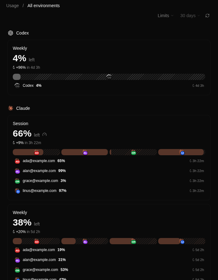
Each account is identifiable without opening its popover. The bar and its legend row show the account's own mark — the provider glyph with its accent initials badge, or the two-letter chip — the same mark the Limits popover, the model picker and thread rows already draw.
Actual behavior
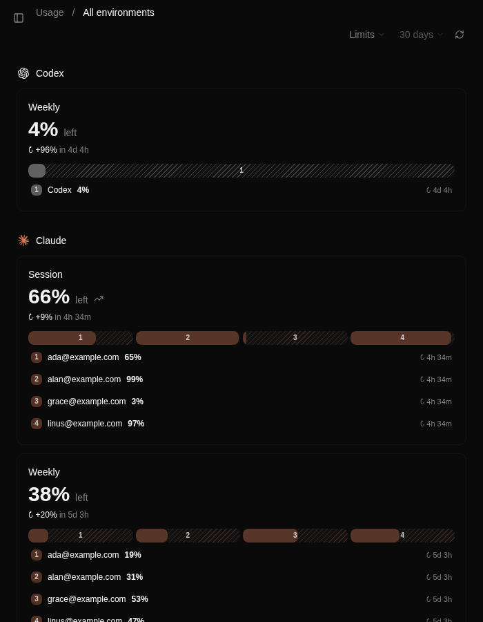
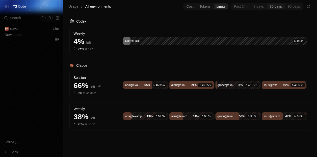
The bar and every legend row label accounts only by position: 1, 2, 3, 4. A user with four Claude accounts cannot tell which segment is which account without hovering each one, and at narrow widths the number is the only thing the segment shows. The identity mark already exists in the code (AccountAvatar / ProviderInstanceIcon) and is already drawn in the segment popover; the bar just does not use it.
Impact
Cosmetic issue
Version or commit
main @ 50ff4c3 (0.0.40)
Environment
macOS desktop app (web renderer), dark theme. Also reproducible in the browser client.
Logs or stack traces
No response
Screenshots, recordings, or supporting files
Before — position numbers are all the bar exposes for identity:
After — the account's own mark (provider glyph + accent initials badge):
Same, wide layout:
| Before |
After |
 |
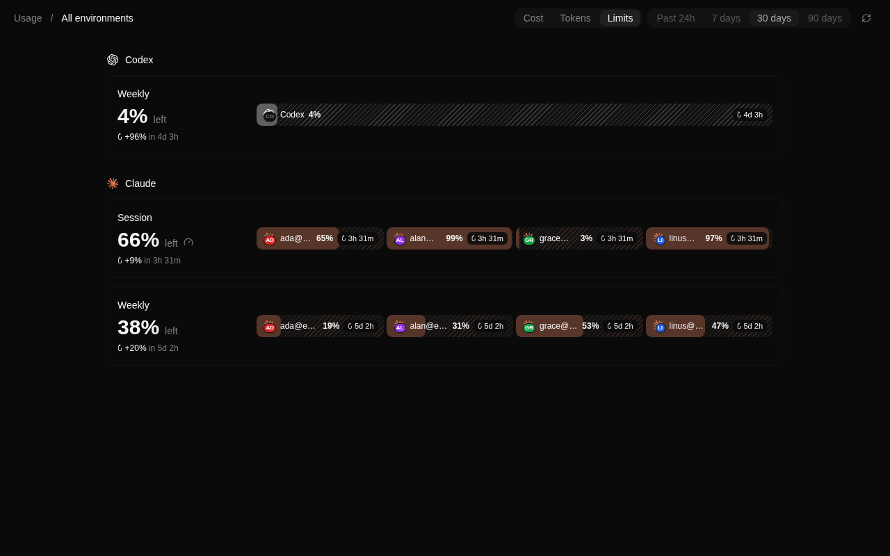 |
Captured against a synthetic four-account pool; the numbers are the only account identity the bar currently renders.
Workaround
Open each segment's popover to read the account. There is no in-app way to label the bar.
Related issues
Not a duplicate: no existing issue or PR changes the pooled bar's account labels.
Suggested fix
Reuse the existing mark instead of the number: web's AccountAvatar in apps/web/src/components/usage/UsageLimitsPooled.tsx, mobile's ProviderInstanceIcon in apps/mobile/src/features/usage/UsageLimitsPooled.tsx. Small, no new component. A PR follows.
Before submitting
Area
apps/web
Steps to reproduce
Expected behavior
Each account is identifiable without opening its popover. The bar and its legend row show the account's own mark — the provider glyph with its accent initials badge, or the two-letter chip — the same mark the Limits popover, the model picker and thread rows already draw.
Actual behavior
The bar and every legend row label accounts only by position:
1, 2, 3, 4. A user with four Claude accounts cannot tell which segment is which account without hovering each one, and at narrow widths the number is the only thing the segment shows. The identity mark already exists in the code (AccountAvatar/ProviderInstanceIcon) and is already drawn in the segment popover; the bar just does not use it.Impact
Cosmetic issue
Version or commit
main @ 50ff4c3 (0.0.40)
Environment
macOS desktop app (web renderer), dark theme. Also reproducible in the browser client.
Logs or stack traces
No response
Screenshots, recordings, or supporting files
Before — position numbers are all the bar exposes for identity:
After — the account's own mark (provider glyph + accent initials badge):
Same, wide layout:
Captured against a synthetic four-account pool; the numbers are the only account identity the bar currently renders.
Workaround
Open each segment's popover to read the account. There is no in-app way to label the bar.
Related issues
ProviderInstanceIcon.Not a duplicate: no existing issue or PR changes the pooled bar's account labels.
Suggested fix
Reuse the existing mark instead of the number: web's
AccountAvatarinapps/web/src/components/usage/UsageLimitsPooled.tsx, mobile'sProviderInstanceIconinapps/mobile/src/features/usage/UsageLimitsPooled.tsx. Small, no new component. A PR follows.