Dithered charts for React Native.
Line, area, bar, pie, donut, and radar charts rendered with Skia. Built for mobile screens that need texture, fast touch feedback, and clear data states without a heavy charting setup.
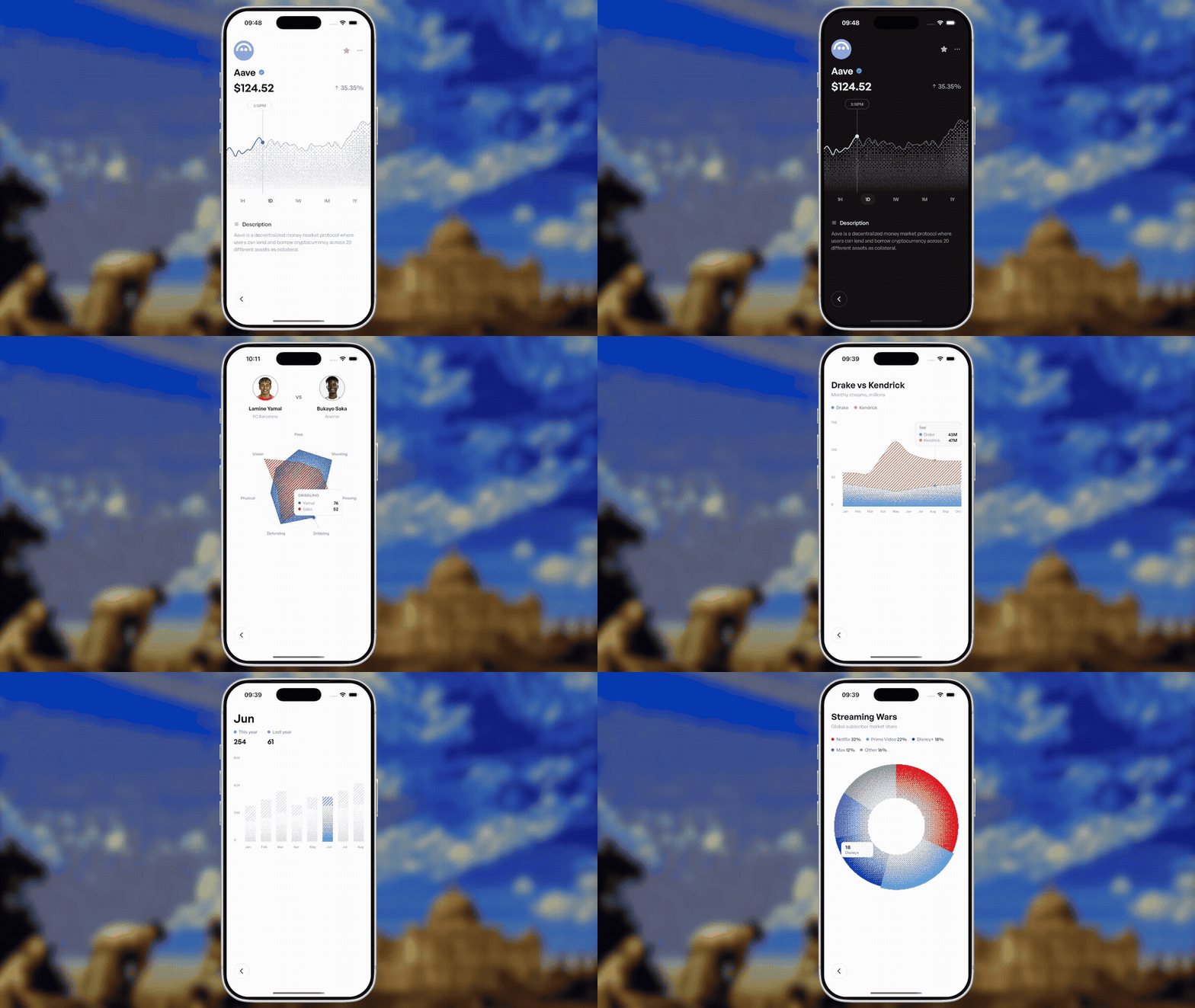
DitherBarChartDitherStackedBarDitherLineChartDitherMultiLineChartDitherAreaChartDitherStackedAreaChartDitherPieChart/DitherDonutChartDitherRadarChartDitherRangeFilter— a "1D / 1W / 1M / 3M / 1Y / All" segmented timeframe picker
yarn add react-native-dither-charts @shopify/react-native-skiaIn an Expo app, let Expo select compatible native versions:
npx expo install @shopify/react-native-skia react-native-reanimated react-native-workletsimport { DitherBarChart, ditherPalette } from "react-native-dither-charts";
const data = [
{ label: "Mon", value: 24 },
{ label: "Tue", value: 44 },
{ label: "Wed", value: 32 }
];
export function Demo() {
return (
<DitherBarChart
data={data}
width={320}
height={180}
color={ditherPalette.blue}
dither={{
variant: "gradient",
cellSize: 4,
startDensity: 0.18,
endDensity: 1
}}
/>
);
}For striped fills, use variant: "hatched". Add pixelated: true when you want stepped square-pixel
stripes instead of smooth diagonal strokes:
dither={{ variant: "hatched", pixelated: true, cellSize: 2, gap: 8, strokeWidth: 4 }}Every chart can render its own axis labels — off by default, so existing usage is unaffected.
<DitherBarChart
  data={data}
  width={320}
  height={180}
  xAxis={{ visible: true }}
  yAxis={{
    visible: true,
    ticks: 4,
    labelColor: "#73727E",
    formatLabel: (value) => `${Math.round(value)}k`
  }}
/>
xAxis and yAxis are configured independently. Set visible: false or omit one to hide it. Both accept
size (the label gutter's width/height), formatLabel, labelColor, fontSize, and fontFamily; the
y-axis also accepts ticks. Visible axes use space inside the width/height you pass, so the component's
outer footprint stays stable.
Drag a finger across a Cartesian chart to read the nearest datum. Scrubbing, its guide, and the tooltip are separate decisions: you can show both, either one, or neither and use only the callback.
<DitherAreaChart
  data={data}
  width={320}
  height={180}
  scrub={{
    showLine: true,
    showDot: true,
    lineColor: "#777681",
    dotRadius: 3
  }}
  tooltip={{ formatValue: (value) => `$${value}` }}
  onScrub={(info) => {
    // `values` contains every series at this index on multi-series charts.
    setHeaderValues(info?.values ?? []);
  }}
/>
scrub can be true or an object with showLine, showDot, line styling, dot styling, and halo styling.
It works without a tooltip. onScrub receives { index, datum, value, values, x, y } while active and
null on release.
tooltip can be true, a style/formatter object, or a render function for a fully custom component:
<DitherMultiLineChart
  labels={months}
  series={series}
  width={320}
  height={180}
  scrub={{ showLine: true, showDot: false }}
  tooltip={({ x, datum, values }) => (
    <ChartTooltip x={x} label={datum.label} values={values ?? []} />
  )}
/>
Set tooltip={false} to keep the guide and use onScrub to render the active values elsewhere.
Multi-series area, bar, and radar charts can dim the other series when one is tapped. Scrubbing temporarily restores every series so comparison remains legible.
<DitherStackedAreaChart
  data={data}
  width={320}
  height={180}
  focusOnPress
  dimOpacity={0.2}
  focusedSeries={focusedSeries}
  onSeriesFocus={setFocusedSeries}
/>
Omit focusedSeries for internal state, or pass it for a controlled chart. Use focusOnPress={false} to
disable the behavior.
DitherMultiLineChart deliberately keeps every line visible: comparison is its primary job. Each series can
still provide its own dither, while omitted series styles inherit the chart-level ordered dither.
Pie and donut charts use a different selection model. Tapping a slice adds a small outer protrusion without changing the slice texture or muting the rest:
<DitherDonutChart
  data={browserShare}
  width={320}
  height={320}
  activeScale={1.025}
  baseOpacity={0.12}
  tooltip={{ position: "point" }}
  onSliceFocus={setActiveSlice}
/>
Radar charts also accept scrub, tooltip, and onScrub. Their guide follows the nearest category axis
and reports every series value at that vertex.
DitherRangeFilter is a plain, uncontrolled-free segmented control — you own the value and swap your
chart's data source in onChange:
import { DitherRangeFilter, defaultDitherRanges } from "react-native-dither-charts";

const [range, setRange] = useState("1M"); // one of defaultDitherRanges' keys: 1D, 1W, 1M, 3M, 1Y, ALL

<DitherRangeFilter value={range} onChange={setRange} />
Pass a custom ranges array to use different keys/labels (e.g. just ["1W", "1M", "ALL"]).
Use the Node version in .nvmrc first. The example targets Expo SDK 54 so it runs in the matching Expo Go
runtime on a physical iPhone.
nvm use
yarn install
yarn example
The example app uses Expo and resolves react-native-dither-charts directly from
package/src through the Yarn workspace, so renderer edits update without
reinstalling a copied package.