A traveling or breathing glow around any widget — cards, buttons, inputs, search bars.





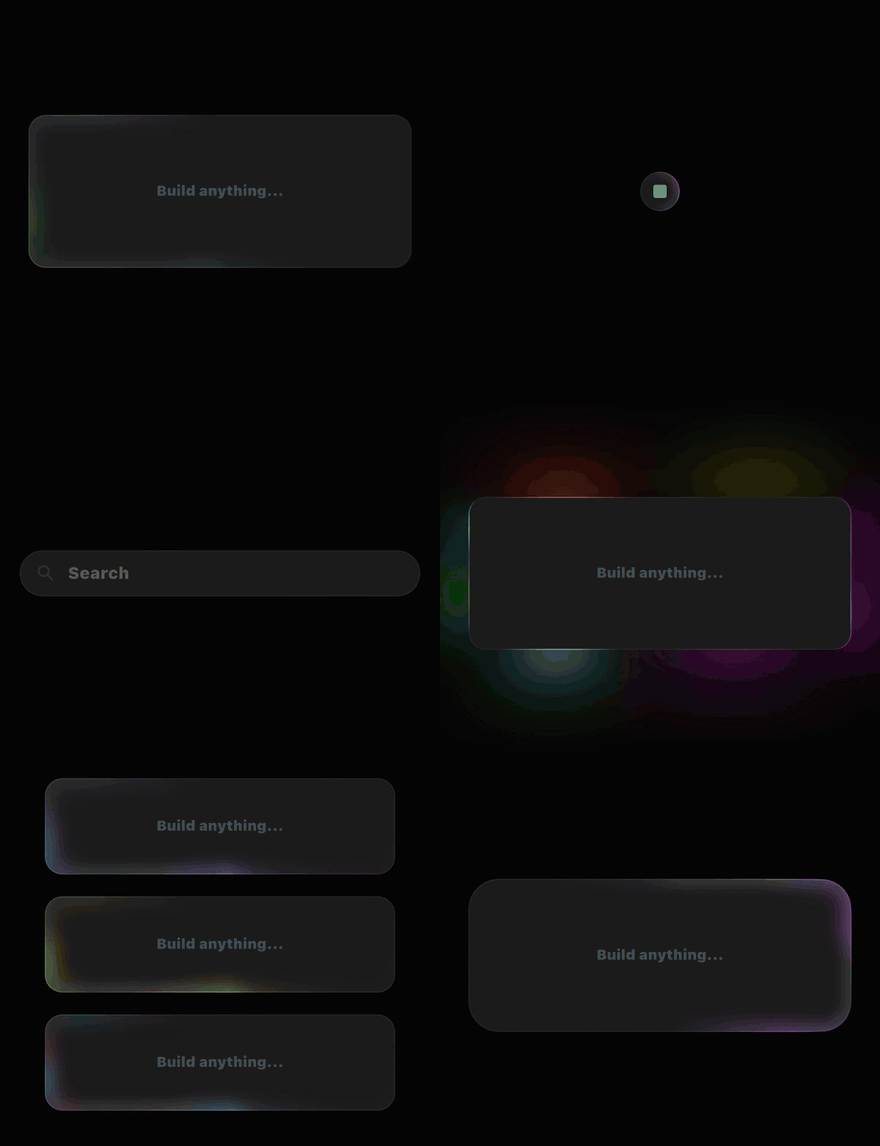
A faithful Flutter port of the border-beam React library by Jakub Antalik (live demo). Every palette, gradient, mask, blur, and timing constant is transcribed from the original source, so the effects are pixel-matched — with Flutter-native additions on top.
Five variants, each a named constructor with tuned defaults:
rotate— a beam travels the full border. Cards, surfaces, panels.small— the compact cut, on a 32px radius. Icon buttons, chips.line— a streak rides one edge, with a bloom and spikes. Inputs, search bars.pulseInside— a contained glow breathing inward from the border.pulseOutside— a halo blooming outward, behind the child.
 Rotate — a beam travels around the border |
 Pulse outside — a breathing halo blooms behind the child |
 Line — the beam rides the bottom edge |
 Superellipse — Apple-style squircle borders, ocean palette
|
And on top of the effects themselves:
- Eleven palettes — the four from the original plus seven Flutter-only ones, with
custom,fromSeedharmonies,fromScheme,lerp,scaleAlpha, and per-blobspec. - Value-object API —
BeamStyle,BeamShape,BeamTiming,BeamPlayback; every field nullable, so anything you leave out is inherited from aBorderBeamThemeor the variant default. - Shapes — per-corner direction-aware radii, stadium, Apple-style superellipse, ring offset, arbitrary path contours, partial segments, and corner-wrapping lines.
- Motion — cycle gap, forward / reverse / bounce, phase offset, several beams on one contour, driven
progress, pointerfollow. - Synchronized groups —
BeamSyncputs a whole subtree on one ticker and one timeline, so a row of cards reads as one system. - Surfaces & interactions —
BorderBeam.overlay, aBeamDecorationfor existingContainers, andBeamFocusRing/BeamHover/BeamPress. - Accessible — four documented reduced-motion behaviors; beams add no semantics and never intercept a pointer.
- Fast — one ticker per beam, a ~30fps cap on the pulse variants,
RepaintBoundaryisolation, CPU-folded color matrices, an offscreen pause, and asaveLayerbudget pinned by a test.
https://simplifyjobs.github.io/flutter_border_beam/ — every variant, palette, and tuning hook on live controls, with the matching Dart snippet and a shareable link. Built from example/.
flutter pub add flutter_border_beamimport 'package:flutter_border_beam/flutter_border_beam.dart';| Requirement | Version |
|---|---|
| Flutter | ≥ 3.35 (stable RoundedSuperellipseBorder / RSuperellipse) |
| Dart | ≥ 3.9 |
| Dependencies | none beyond the Flutter SDK |
Tracks upstream border-beam 1.4.0. Where this package deliberately differs from the original, and why, is spelled out in Parity with the original.
BorderBeam.rotate(
  borderRadius: 16,
  colors: BeamColors.ocean,
  child: Card(
    shape: RoundedRectangleBorder(borderRadius: BorderRadius.circular(16)),
    child: const Padding(
      padding: EdgeInsets.all(24),
      child: Text('Working on it…'),
    ),
  ),
)
That is the whole API for the common case. Everything else is a field on one of four value objects — style, shape, timing, playback — and every one of their fields is nullable, meaning inherit.
BorderBeam(
  variant: BeamVariant.line,
  style: const BeamStyle(colors: BeamColors.sunset, strength: 0.8),
  shape: const BeamShape.all(24, superellipse: true),
  timing: const BeamTiming(cycleGap: Duration(seconds: 1)),
  playback: const BeamPlayback(reducedMotion: BeamReducedMotion.staticFrame),
  child: card,
)BorderBeam.rotate(child: card); // full border beam — cards, surfaces
BorderBeam.small(child: iconButton); // compact — buttons, chips (32px radius)
BorderBeam.line(child: searchBar); // travels one edge — inputs
BorderBeam.pulseInside(child: card); // contained breathing glow
BorderBeam.pulseOutside(child: card); // halo blooming outward behind the child
// Picked at runtime — same parameters, no switch:
BorderBeam(variant: variant, child: card);| Variant | Upstream name | Family | Default cycle | Default radius | Default hue track | Paints |
|---|---|---|---|---|---|---|
rotate |
md |
traveling | 1.96s | 16 | ping-pong, 12s | over the child |
small |
sm |
traveling | 1.96s | 32 | ping-pong, 12s | over the child |
line |
line |
traveling | 3.1s | 16 | ping-pong, 12s (bloom 8s) | over the child |
pulseInside |
pulse-inner |
pulse | 2.3s | 16 | continuous, 16s | over the child |
pulseOutside |
pulse-outside |
pulse | 2.3s | 16 | continuous, 14s | behind and outside the child |
The two families differ in more than looks: the traveling variants sweep a window around the contour and respond to direction, cycleGap, beamCount, progress, and follow; the pulse variants breathe from a bank of oscillators and ignore all of those.
⚠️ pulse-outside contract (the same one the original states): the child must be opaque, so only the outward spill shows; it should carry its own 1px border for a defined idle edge; and it needs clip-free room around it — padding in the parent, no tightClipRRect. A halo with nowhere to bloom is a halo you cannot see.
// Presets
BorderBeam.rotate(colors: BeamColors.ocean, child: card);

// Your own colors, distributed over the preset blob geometry
BorderBeam.rotate(
  colors: const BeamColors.custom([Colors.pink, Colors.cyan, Colors.amber]),
  child: card,
);

// One brand color, spread into a harmony
BorderBeam.rotate(
  colors: const BeamColors.fromSeed(
    Color(0xFF18A8F0),
    harmony: BeamSeedHarmony.triadic,
  ),
  child: card,
);

// The app's Material scheme
BorderBeam.rotate(
  colors: BeamColors.fromScheme(Theme.of(context).colorScheme),
  child: card,
);

// Blend two palettes, and dim one
BorderBeam.rotate(
  colors: const BeamColors.lerp(BeamColors.ocean, BeamColors.sunset, 0.35),
  child: card,
);
BorderBeam.rotate(colors: BeamColors.ember.scaleAlpha(0.6), child: card);| Preset | Origin | Colors | Notes |
|---|---|---|---|
colorful |
upstream | rainbow spectrum | the default |
mono |
upstream | grayscale | pins the hue and halves layer opacity |
ocean |
upstream | blue, purple | |
sunset |
upstream | orange, yellow, red | |
aurora |
Flutter-only | teal, violet, green, glacier blue | |
neon |
Flutter-only | magenta, cyan, lime | the loudest |
candy |
Flutter-only | pink, lavender, peach | pastel |
ember |
Flutter-only | deep red, orange, gold | |
ice |
Flutter-only | pale blue, white, cyan | |
gold |
Flutter-only | amber, gold, bronze | pins the hue, keeps full opacity |
holographic |
Flutter-only | desaturated pastels | built to be paired with a fast continuous hue drift |
Every BeamColors is a value type and resolution is memoized by value, so rebuilding BeamColors.custom([...]) inline in build does not re-resolve the gradient tables.
// Uniform radius, const
BorderBeam.rotate(
  shape: const BeamShape.all(24, superellipse: true),
  child: card,
);

// Per-corner, direction-aware
BorderBeam.rotate(
  shape: const BeamShape(
    radius: BorderRadiusDirectional.only(topStart: Radius.circular(28)),
  ),
  child: card,
);

// A pill (a circle on a square box) that tracks the box as it resizes
BorderBeam.small(shape: const BeamShape.stadium(), child: chip);

// The ring 8px outside the child, with the beam on the top edge
BorderBeam.line(
  shape: const BeamShape.all(16, ringOffset: 8, edge: BeamEdge.top),
  child: card,
);

// An arbitrary contour
BorderBeam.rotate(
  shape: BeamShape(
    contour: BeamPathContour((rect) => Path()..addOval(rect), key: 'oval'),
  ),
  child: card,
);
Three constructors cover the common cases: BeamShape.all(r) is the const path to a uniform radius (it stores the number rather than building a BorderRadius), BeamShape.circular(r) is the same shape when you already think in BorderRadius terms (not const), and BeamShape.stadium() rounds each corner to half the shortest side. radius resolves against the ambient Directionality and clamps per corner the way RRect.scaleRadii does.
There is no auto-detection of the child's radius — pass the same value your child uses.
BeamShape.segment masks the unchanged full-ring animation to a clockwise portion of the contour. Constants and blob positions stay in full-ring space, and the mask adds no compositing layer.
BorderBeam.rotate(
  shape: const BeamShape(
    radius: BorderRadius.all(Radius.circular(24)),
    segment: BeamSegment.bottomHalf,
  ),
  child: square,
);
Positions are arc-length fractions from top-center, clockwise: 0 is top-center, 0.25 approximately right-center on a square, 0.5 bottom-center, 0.75 approximately left-center. Build endpoints with BeamAnchor.fraction(t), BeamAnchor.edge(edge, t), or BeamAnchor.corner(corner, t), or use topCenter / rightCenter / bottomCenter / leftCenter. BeamSegment(start: …, end: …, feather: 32) runs clockwise from start to end, wrapping through top-center when necessary; feather is the fade distance in logical pixels at each end, and 0 makes a hard cut.
| Preset | Coverage |
|---|---|
bottomHalf / topHalf |
The lower / upper half between the side centers |
leftHalf / rightHalf |
The left / right half between the top and bottom centers |
bottomEdge / topEdge |
The named straight run plus both adjacent corner arcs |
leftEdge / rightEdge |
The named straight run plus both adjacent corner arcs |
Each family reads a segment differently: rotate / small keep the conic window's full sweep, appearing at start and traveling to end; line rides the segment, rounding its corners and fading at both ends (shape.edge is ignored while a segment is set); pulse hides blobs outside the segment and fades those near either end.
For two counter-sweeping arcs, stack a second beam with timing: const BeamTiming(direction: BeamDirection.reverse). For a full-contour line, wrapCorners: true bends the streak around the two corner arcs adjacent to edge.
BorderBeam.rotate(
  style: const BeamStyle(
    colors: BeamColors.aurora,
    strength: 0.8,
    comet: true,
    sparkle: 0.4,
    tailLength: 1.4,
  ),
  child: card,
);
Twenty-six fields, all listed in the BeamStyle reference. Four are worth a sentence each.
themeConfig replaces the whole variant × brightness preset — layer opacities, inset shadow, and the default brightness/saturation. Start from a preset rather than inventing one:
BorderBeam.rotate(
  style: BeamStyle(
    themeConfig: BeamThemeConfig.presetFor(
      BeamVariant.rotate,
      Brightness.dark,
    ).copyWith(bloomOpacity: 0.4),
  ),
  child: card,
);
innerSizeScale multiplies the size of pulseInside's inner blobs. Below 1 the wash pulls tighter to the border, leaving more of the child clear; above 1 it floods further in. The perimeter ring and the bloom keep their own geometry, so the border itself does not move.
renderScale is the fraction of the box the beam is painted at before being magnified back to fill it (0.25–1). The palettes are authored against a 350×140 card, so on a screen-width box the blobs read as small and sparse; painting at 0.5 and magnifying restores the proportions the palette was drawn for — glow, blurs, and corner radii all grow together. It costs one canvas transform and no extra layer, but it is a magnification, so the ring's own edge softens as the factor drops.
BorderBeam.rotate(
  style: const BeamStyle(renderScale: 0.35),
  child: fullScreenSurface,
);
BeamStyle.pulseOutsideStock is a ready-made style carrying the upstream library's stock pulse-outside look — a tighter, dimmer halo sitting closer to the child. BorderBeam.pulseOutside paints the tuned demo recipe by default, because that is the look the library is known for; the stock style rolls every part of that tuning back. Layer your own fields over it with copyWith — anything you set wins.
BorderBeam.pulseOutside(style: BeamStyle.pulseOutsideStock, child: card);BorderBeam.rotate(
timing: const BeamTiming(
cycle: Duration(seconds: 3), // one sweep
cycleGap: Duration(seconds: 1), // rest between sweeps
direction: BeamDirection.bounce, // alternate each cycle
beamCount: 3, // three beams, equally spaced
speed: 1.5, // playback rate
),
child: card,
);Changing cycle while the beam runs retimes it in place — every track keeps its phase, so the beam speeds up or slows down without a jump. cycleGap parks the beam at the end of its travel between sweeps, fading out and back in over min(0.25s, gap / 2) at each end; the hue, breathe, and spike tracks are textures rather than the sweep, so they keep running through the gap. Every field is in the BeamTiming reference.
BorderBeam.pulseInside(
  active: isLoading,                          // fades in 0.6s / out 0.5s
  playback: const BeamPlayback(
    startAfter: Duration(milliseconds: 500),
    duration: Duration(seconds: 10),
    repeat: BeamRepeat.count(3),
    reducedMotion: BeamReducedMotion.staticFrame,
  ),
  onActivate: () => debugPrint('visible'),    // when the fade-in completes
  onDeactivate: () => debugPrint('hidden'),
  child: card,
);
reducedMotion has four behaviors, all of them applying to all five variants:
BeamReducedMotion |
Behavior |
|---|---|
staticFrame |
Paints a single static frame and stops ticking. The default. |
hide |
Paints nothing; the child is left bare and no ticker runs. |
slow |
Keeps animating at a quarter of the configured speed. |
animate |
Ignores the request and animates normally. |
debugFrozenAt pins the beam to one instant and never starts its clock — for screenshots and tests rather than product code. Every animated value is a pure function of elapsed time, so a fixed time is a fixed frame: two runs a week apart paint the same pixels.
fadeCurve swaps the fade envelope. The package eases fades with a spring, which carries a little momentum and overshoots slightly; BeamPlayback.cssEase is the web's cubic-bezier(0.25, 0.1, 0.25, 1), for a fade that matches the original exactly.
The full field list is in the BeamPlayback reference.
BorderBeamTheme(
  data: const BorderBeamThemeData(
    style: BeamStyle(colors: BeamColors.ocean, strength: 0.8),
    shape: BeamShape.all(20, superellipse: true),
    timing: BeamTiming(cycle: Duration(seconds: 3)),
    playback: BeamPlayback(reducedMotion: BeamReducedMotion.slow),
  ),
  child: MaterialApp(home: home),
);
BorderBeamThemeData has one slot per value object, and each slot's fields are nullable, so a theme fills in only what it sets. BorderBeamTheme.of walks every enclosing scope, depends on each, and merges them outside-in — an inner theme overrides just the fields it names, and a change to an outer one rebuilds the beam exactly as an inner one does.
Attach a BorderBeamController for programmatic playback. The controller takes full ownership: playback.startAfter and playback.duration must not be set (on the widget or on a theme — it is asserted), active and autoPlay are ignored, the controller's speed replaces timing.speed, and the beam starts hidden until you start().
final controller = BorderBeamController();

BorderBeam.rotate(controller: controller, child: card);

controller.start();                      // fade in, play
controller.pause();                      // freeze the current frame
controller.resume();
controller.speed = 2;                    // playback rate; must be positive
controller.seek(const Duration(seconds: 1));
controller.pulse();                      // one brightness bump, ~0.6s settle
controller.flash();                      // blink to full, hold 120ms, decay
controller.stop(); // fade out, haltisAttached, isActive, and isRunning report state, and the controller is a ChangeNotifier, so a button can rebuild from it. One controller drives one beam — attaching a second asserts. A beam under a BeamSync runs on the group's clock and cannot also take a controller; drive the group through BeamSync instead.
stop() fades out over 0.5s; pause() freezes the current frame with no fade at all, and resume() continues from exactly there. pulse() and flash() are accents on a running beam: they raise brightness and let it settle without touching the timeline, so a beam already sweeping can mark a moment. Both are no-ops while the beam is hidden or frozen.
Four inputs take the beam off its own schedule without a controller.
// A glowing progress ring (or, with .line, a progress bar).
BorderBeam.rotate(progress: downloaded / total, child: card);

// The sweep gravitates to a point in the box.
BorderBeam.rotate(follow: const Offset(0.5, 0.2), child: card);

// Live opacity and rate, without rebuilding.
BorderBeam.rotate(
  strengthListenable: micLevel, // ValueListenable<double>
  speedListenable: tempo,       // ValueListenable<double>, positive
  child: card,
);| Input | Type | Effect |
|---|---|---|
progress |
double? (0–1) |
Places the sweep instead of the clock. The clock still runs, so the fade, hue, and line tracks stay alive — the beam looks lit, not frozen. Repaints without re-resolving the config, so it is cheap to drive from an animation. |
follow |
Offset? (normalized) |
Eases the sweep to the perimeter point nearest a point in the box — critically damped, ~150ms. Setting it back to null hands the sweep back to the clock without a snap. progress wins over it. |
strengthListenable |
ValueListenable<double>? |
The live twin of style.strength: scales every layer's opacity each frame, no rebuild. |
speedListenable |
ValueListenable<double>? |
The live twin of timing.speed, and it wins over both that and a controller's rate. |
The pulse variants have no travel, so they ignore progress and follow. Feeding follow from a MouseRegion is what BeamHover does for you.
A beam owns its own ticker. Ten beams on a screen means ten tickers, each started at a different instant, so their sweeps drift apart — right for beams that have nothing to do with each other, wrong for a row of cards that should read as one system. BeamSync hands the whole subtree one clock: one ticker, one timeline, identical phases.
BeamSync(
  child: Row(
    children: [
      for (final (i, card) in cards.indexed)
        BorderBeam.rotate(
          timing: BeamTiming(phaseOffset: i / cards.length),
          child: card,
        ),
    ],
  ),
);
Beams stay individually configurable — palette, variant, shape, and phaseOffset are per beam — but the group owns playback: active, autoPlay, startAfter, duration, and repeat are ignored below a BeamSync. Use its own active and speed instead. Reduced motion is group-owned too, through BeamSync.reducedMotion.
BorderBeam.overlay is a beam with no child of its own, sized by its parent — it traces content it does not have to wrap:
Stack(
  children: [
    content,
    const Positioned.fill(child: BorderBeam.overlay(borderRadius: 16)),
  ],
);
BeamDecoration is the same engine as a Decoration, for dropping into a Container you already have:
Container(
  foregroundDecoration: BeamDecoration(
    variant: BeamVariant.rotate,
    brightness: Theme.of(context).brightness,
    theme: BorderBeamTheme.of(context),
    colors: BeamColors.ocean,
    borderRadius: 16,
  ),
  decoration: BoxDecoration(
    color: surface,
    borderRadius: BorderRadius.circular(16),
  ),
  child: content,
);
A decoration paints in exactly one slot, so the variant decides which: rotate, small, line, and pulseInside go in foregroundDecoration:; pulseOutside goes in decoration:, because its halo blooms behind the child.
A BoxPainter gets a canvas and nothing else, which costs the decoration four things the widget has. Prefer BorderBeam when any of them matter:
- Ambient theming is passed in, not read.
brightnessis required andtheme:takes whatBorderBeamTheme.of(context)would have returned. - The ticker is unmanaged. It is not created through a
TickerProvider, soTickerModedoes not mute it — a beam in a scrollable's cache extent or under an inactive route keeps ticking until the decoration is replaced or its render object is disposed. - Reduced motion is not observed.
MediaQuery.disableAnimationsOfis unreachable, soplayback.reducedMotionis inert here. activeis a starting state, not a toggle, and the decoration does not interpolate:lerpFrom/lerpToreturn null, so anAnimatedContainersnaps between two beam decorations at the halfway point.
Like the widget, it never absorbs a pointer: hitTest returns false.
BeamFocusRing(borderRadius: 12, child: TextField(decoration: decoration));
BeamHover(borderRadius: 20, child: pricingCard);
BeamPress(borderRadius: 20, onTap: submit, child: card);| Widget | Lights when | Default variant | Notable knobs |
|---|---|---|---|
BeamFocusRing |
child's subtree (or focusNode) holds focus |
small, ocean |
alwaysShow lights it under FocusHighlightMode.touch too |
BeamHover |
the cursor is over child, pulling the sweep toward it |
rotate |
followPointer, holdAfterExit (300ms) |
BeamPress |
a finger is down on child |
pulseInside |
minimumDuration (600ms), onTap |
Each is a thin wrapper that flips BorderBeam's active (and, for BeamHover, feeds follow), so a transition gets the beam's own fades rather than a cut, and each passes style, shape, and timing straight through.
BeamFocusRing follows FocusManager.highlightMode, the same rule FocusableActionDetector uses: it shows for keyboard and mouse focus and stays dark for touch. BeamHover is a desktop and web wrapper — on a touch device no mouse ever enters and the beam stays dark; BeamPress is its touch counterpart, holding the beam lit until minimumDuration has passed so a quick tap is a pulse rather than a flicker. BeamPress observes raw pointer events through a translucent Listener and never enters the gesture arena, so a button inside keeps its own taps and a scrollable above keeps its drags.
Every field is nullable and a null means inherit, so these tables are the defaults you get by leaving a field out.
| Field | Type | Default | Applies to |
|---|---|---|---|
colors |
BeamColors? |
BeamColors.colorful |
all |
theme |
BeamTheme? |
BeamTheme.auto |
all |
strength |
double? |
1.0 (clamped 0–1) |
all |
brightness |
double? |
preset, else 1.3 |
all |
saturation |
double? |
preset | all |
hueRange |
double? |
30 (line caps at 13) |
all |
hueMode |
BeamHueMode? |
pingPong traveling, continuous pulse |
all |
hueBase |
double? |
0 |
all |
staticColors |
bool? |
false (forced on by mono and gold) |
all |
strokeOpacityFactor |
double? |
1 |
all |
innerOpacityFactor |
double? |
1 |
all |
bloomOpacityFactor |
double? |
1 |
all |
glowBoost |
double? |
1 |
pulseInside, pulseOutside |
coreBlur |
double? |
preset | pulseOutside |
bloomBlur |
double? |
preset | pulseOutside |
glowBrightness |
double? |
preset | pulseOutside |
glowSaturation |
double? |
preset | pulseOutside |
tailLength |
double? |
1 |
rotate, small |
glowSpread |
double? |
1 |
all |
comet |
bool? |
false |
rotate, small |
sparkle |
double? |
0 (clamped 0–1) |
rotate, small |
segments |
int? |
none (solid ring) | rotate, small, line |
innerSizeScale |
double? |
1 |
pulseInside |
renderScale |
double? |
1 (clamped 0.25–1) |
all |
pulseOutsideTuning |
BeamPulseOutsideTuning? |
demo |
pulseOutside |
themeConfig |
BeamThemeConfig? |
per variant × brightness | all |
pulseOutsideTuning switches only the glow geometry: BeamPulseOutsideTuning.demo (the default) scales insets and blurs by the element's size, melting the separate blobs into one continuous edge-hugging glow; .stock uses the library's fixed insets and per-brightness blur.
| Field | Type | Default | Applies to |
|---|---|---|---|
radius |
BorderRadiusGeometry? |
16 (32 for small) |
all — ignored when contour is set |
borderWidth |
double? |
1 |
all |
superellipse |
bool? |
false |
all — ignored when contour is set |
edge |
BeamEdge? |
BeamEdge.bottom |
line |
ringOffset |
double? |
0 |
all |
contour |
BeamContour? |
none | all |
segment |
BeamSegment? |
none (full contour) | all |
wrapCorners |
bool? |
false |
line, without a segment |
| Field | Type | Default | Applies to |
|---|---|---|---|
cycle |
Duration? |
1.96s rotate/small · 3.1s line · 2.3s pulse | all |
cycleGap |
Duration? |
Duration.zero |
rotate, small, line |
speed |
double? |
1 (a controller's speed wins) |
all |
direction |
BeamDirection? |
forward |
rotate, small, line |
phaseOffset |
double? |
0 (fraction of a cycle, 0–1) |
all |
beamCount |
int? |
1 |
rotate, small, line |
huePeriod |
Duration? |
12s traveling · 16s pulseInside · 14s pulseOutside | all |
bloomHuePeriod |
Duration? |
8s | line |
breatheFactor |
double? |
1.3 × cycle |
line |
spikeFactor |
double? |
1.33 × cycle |
line |
spike2Factor |
double? |
1.7 × cycle |
line |
| Field | Type | Default | Meaning |
|---|---|---|---|
active |
bool? |
true |
Play state. Toggling fades in (0.6s) / out (0.5s). |
autoPlay |
bool? |
true |
Whether the beam starts by itself. |
startAfter |
Duration? |
none | Delay before autoplay. Must be null with a controller. |
duration |
Duration? |
none (plays on) | Total play time before a self fade-out. Must be null with a controller. |
repeat |
BeamRepeat? |
BeamRepeat.forever() |
forever(), once(), or count(n) cycles, then a fade-out. |
reducedMotion |
BeamReducedMotion? |
staticFrame |
What to do when the platform asks for reduced motion. |
pauseWhenOffscreen |
bool? |
true |
Stops the clock while the beam is scrolled out of its nearest enclosing Scrollable, with a 256px margin. |
fadeCurve |
Curve? |
the fade spring | The easing both fade envelopes run on. |
debugFrozenAt |
Duration? |
none | Pins the beam to one instant of its timeline and never starts its clock. The frozen frame is still scaled by the live strength. |
| Constructor / transform | Signature | What it does |
|---|---|---|
BeamColors.custom |
custom(List<Color> colors, {BeamColors base = BeamColors.colorful}) |
Distributes your colors over base's blob geometry, cycling when there are fewer colors than slots and preserving each entry's alpha. The list must not be empty. |
BeamColors.fromSeed |
fromSeed(Color seed, {BeamSeedHarmony harmony = BeamSeedHarmony.analogous}) |
Spreads one brand color into analogous, complementary, triadic, or monochrome. Derived colors are lifted into a readable glow band (lightness 0.55–0.70, saturation ≥ 0.55), so a black or gray seed still reads. |
BeamColors.fromScheme |
fromScheme(ColorScheme scheme) |
Takes primary, secondary, tertiary, dropping roles that duplicate an earlier one. |
BeamColors.lerp |
lerp(BeamColors a, BeamColors b, double t) |
Table-by-table Color.lerp. t is not clamped, so it extrapolates. |
scaleAlpha |
scaleAlpha(double factor) |
Multiplies every table entry's alpha, preserving the relative depth of the inner / stroke / bloom layers. factor must not be negative. |
BeamColors.spec |
spec({required List<BeamBlob> border, List<BeamBlob>? smallBorder, List<LineBlob>? lineBlobs}) |
Full per-blob control. BeamBlob.size holds ellipse radii, not diameters; omitted tables are derived by cycling the border colors. |
Three fields are common enough to sit directly on the widget: colors, active, and borderRadius (a uniform shape.radius). They are shorthands, not separate settings — each folds into the matching value object, winning over the same field there.
A field is resolved in one order, and only one:
flat shorthand > value object on the widget > BorderBeamTheme > variant default
Nested BorderBeamThemes merge inner over outer before the widget's own values are applied on top.
- Reduced motion is honored by default. With
MediaQuery.disableAnimationsset, every variant falls back to a single static frame;hide,slow, andanimateare one field away. See the Playback table. - Beams add no semantics. They are decoration, and decoration that announced itself would be noise. Screen readers describe your child exactly as they would without the beam.
- Nothing is conveyed by the beam alone. A beam marks a state that is already stated somewhere else — the button's label, the field's helper text, a status line. Treat it as emphasis, never as the only signal that something is loading, focused, or selected.
- Pointers pass through. No beam layer intercepts a pointer, so hit-testing, focus traversal, and gesture handling behave as if the beam were not there.
BeamFocusRingcomplements the platform focus ring; it does not replace the focused widget's semantics, and it respectsFocusManager.highlightModeso a tapped field does not sprout a keyboard-focus ring.
- One ticker per beam — or exactly one per
BeamSync, however many beams are in the group. - ~30fps cap on the pulse variants, matching the original's pulse driver. Time still accumulates at full resolution; only notifications are throttled, and a
pulse()/flash()boost lifts the cap while it plays. RepaintBoundaryisolation. The child sits in its own boundary inside the beam's, so animating the beam never re-rasterizes your content.- Color matrices are folded on the CPU. Hue, brightness, and saturation are baked into gradient colors rather than carried on a
ColorFilter, which would need a layer of its own. - Offscreen pause. With
pauseWhenOffscreen(the default), a beam scrolled out of its nearest enclosingScrollable— with a 256px margin — stops its clock and resumes exactly where it left off. Play state, fades, and callbacks are untouched.
The saveLayer count per frame — paintBehind plus paintAbove — is a fixed, measured budget, not an estimate:
| Variant | saveLayers per frame |
|---|---|
rotate |
4 |
small |
3 |
line |
4 |
pulseInside |
4 |
pulseOutside |
3 |
test/painting/save_layer_budget_test.dart counts them through a counting canvas for every variant × brightness × palette × time sample and asserts each number exactly, so a regression and an improvement both fail the suite until the table is updated.
The constants are transcribed verbatim from the upstream src/styles.ts, so the rendering matches. Where this package deliberately differs:
| Area | flutter_border_beam | The original |
|---|---|---|
| Fade envelope | A spring (mass 1, stiffness 180, damping 20) | CSS ease — available here as fadeCurve: BeamPlayback.cssEase |
| Reduced motion | All five variants, defaulting to a static frame | Pulse variants only (the web build hides them; iOS and React Native do the same) |
| pulse-outside defaults | Bake the tuning the original's web demo applies | The library's stock values — available here as BeamStyle.pulseOutsideStock |
BeamTheme.auto |
Follows Theme.of(context) |
Follows the OS color scheme |
| Child radius | Passed in; no auto-detection | Read from the child |
Flutter-only additions, with no upstream counterpart: hueBase, custom palettes (custom / fromSeed / fromScheme / lerp / scaleAlpha / spec) and the seven extra presets, per-corner radii, superellipse corners, stadium shapes, arbitrary contours, BeamShape.segment, BeamShape.wrapCorners, segments, direction, cycleGap, beamCount, progress, follow, BeamSync, BeamDecoration, and the BeamFocusRing / BeamHover / BeamPress wrappers.
Everything animated is a pure function of elapsed time — there are no AnimationControllers anywhere.
- Clock. One
Tickerper beam (or perBeamSync) accumulateselapsedSeconds, scaled by the playback rate and gated by the fade envelope. It mirrors the original's single sharedrequestAnimationFrameloop. - Phases. Each frame, a resolver recomputes every animated track from that one number — sweep position, hue, the line variant's breathe and spike scales, the pulse oscillator bank. Same time in, same frame out, which is what makes goldens and
debugFrozenAtpossible. - Strategies. One strategy per variant family turns those phases into geometry: the traveling window and its mask, or the breathing blob table.
- Layers. A single
CustomPainterpaints the stroke ring, the inner glow, and the bloom within the budget above, on abehindpass (pulse-outside) or anabovepass (everything else).
The beam's corners don't match my card's.
Pass the same radius your child uses — borderRadius: or shape.radius. The beam does not read the child's decoration, deliberately: it also wraps widgets that have no decoration to read.
My beam is clipped.
The beam paints outside the child's bounds. pulseOutside needs real room around it, and a positive ringOffset pushes the ring further out still. Add padding in the parent and remove any tight ClipRRect / ClipPath above the beam.
Nothing shows up at all.
Check reduced motion. With reducedMotion: BeamReducedMotion.hide, a platform request for reduced motion paints nothing — that is the behavior working. staticFrame (the default) always leaves a visible frame.
The squircle option does nothing on my Flutter version.
superellipse needs Flutter ≥ 3.35, where RSuperellipse is stable. That is the package's declared minimum, and CI tests against exactly that version.
Why does my segment run the wrong way?
Segments always run clockwise from start to end, wrapping through top-center when needed. Swap the two anchors to select the complementary direction around the contour.
Does it work on web?
Yes — the live playground is a web build of the example app, and CI builds it on every commit. The blur-heavy variants (line, pulseOutside) are the most expensive there, so prefer a single hero beam over a grid of them on web.
Can I animate between two beam configurations?
With BorderBeam, yes — changing cycle retimes in place, and palettes crossfade with BeamColors.lerp driven by an Animation<double>. With BeamDecoration, no: it does not interpolate, so an AnimatedContainer snaps.
example/ is the full gallery — the original demo recreated, with mock chat inputs, task cards, and search bars, plus the interactive playground behind the live playground link, live code snippets, and shareable URLs:
cd example && flutter runDemo reels live in example/lib/*.dart and use the marker-based harness in example/lib/demo_harness.dart. Record one on a booted iOS simulator (requires ffmpeg):
tool/record_demo.sh --target lib/showcase.dart --prefix SHOWCASE --contactOutputs land in .demos/ (gitignored) as 60fps center-cropped mp4s with a contact sheet for review.
Issues and pull requests are welcome — start with CONTRIBUTING.md for the local setup, the golden-test rules, and what a good change looks like here. Security reports go through SECURITY.md.
One rule worth knowing before you open an editor: never tweak values in lib/src/constants/. They are transcribed 1:1 from the upstream source and visual parity depends on them — see doc/parity.md.
This package is a port of border-beam — created and designed by Jakub Antalik and released under the MIT license, with its own home at Jakubantalik/border-beam. All visual design — the five effects, color palettes, gradient geometry, animation timings, and the demo it ships with — is his work. If you like the effect, go star the original.
The Flutter port adds the widget/controller architecture, superellipse shapes, custom palette API, and the canvas rendering engine.
MIT. See LICENSE for details — it includes the original work's copyright notice.